Color Planning Tool for Crochet Projects
This color planning tool for crochet works for striped blankets, granny squares, and corner to corner projects. Start with a color, a mood, or your stash — and we’ll suggest six palette options built around it.
Where are you starting from?
Tell us how you’re thinking about your project today.
Pick your anchor color
Choose a style, then click the color you love most. We’ll suggest six palettes on the next page.
Choose your inspiration
Pick the palette that feels right for your project. We’ll show you six color options based on it.
What’s in your stash?
Click every color you own. Add at least 6 and we’ll give you several palette options to choose from.
Choose your palette
Pick the combination that speaks to you. You can fine-tune the colors after you choose your project.
What are you making?
Choose your project type to start designing.
Design your stripes
Your palette is ready. Adjust the rhythm and weights — the preview updates live.
Design your squares
Create square colorways and see them arranged in a full blanket layout.
Design your hexagons
Create hexagon colorways and see them arranged in a full honeycomb layout.
Design your C2C
Plan your corner-to-corner color layout. Each diagonal stripe is one pass across the grid.
How to Get the Most Out Of This Color Planning Tool
Start with what you already know. If you have a favorite color, use the anchor color path. If you have yarn in your stash, the stash path will only show you palettes built from what you own. If you're starting from scratch with no idea, browse the inspiration palettes first.
Pick more colors than you think you need. On the anchor color path, selecting two or three anchor colors gives you richer, more varied palette suggestions than starting with just one.
The suggestions are a starting point. Once you land on a palette you like, use the Edit palette button to swap out individual colors, add one more, or remove one that isn't working. The tool is flexible — nothing is locked in.
Try all three project designers. Your palette carries across Stripes, Granny Squares, and Corner to Corner without resetting. It's worth switching between them to see how the same colors read in different formats.
Save your plan before you close the tab. Use the Share link at the bottom of the design screen to copy a URL that saves your exact palette and project settings. Bookmark it, paste it into your pattern notes, or send it to a friend.
The sequence calculator does the math for you. In the Stripe designer, scroll down to the Color Sequence Calculator. Enter your finished project length and yarn weight and it tells you exactly how many rows of each color to crochet.
Why Color Planning Matters
We've all been there. You pick up a few skeins at the craft store because they look beautiful together on the shelf, get halfway through your blanket, and realize something is off. Maybe the colors are too similar and the whole thing reads as one muddy blob from across the room. Maybe one color is so dominant it's swallowing everything else. Maybe you just don't love it anymore and you can't figure out why.
Color planning before you start isn't about following rules — it's about making a decision you can feel confident about before you've invested 20 hours and a several skeins of yarn. A few minutes with a color planner can save you from a project you'll never finish.

Color Theory for Crocheters (the only part you actually need)
You don't need to study a color wheel to plan a beautiful crochet project. But understanding a few basic ideas will help you make confident decisions every time.
Tonal palettes use different shades of the same color family — think five blues ranging from pale ice to deep navy. They feel sophisticated and cohesive, and they're very forgiving. If you're newer to working with multiple colors, a tonal palette is a great place to start.
Contrast palettes pair colors from opposite sides of the color wheel — red and green, blue and orange, purple and yellow. When placed next to each other, each color makes the other look more vivid. These palettes are bold and graphic, and they work especially well for projects where you want the color changes to really pop.
Playful or triadic palettes use three or more colors spread across the color wheel. Think red, yellow, and blue together. This style creates a lively, unexpected look. The trick to making it work is adding a neutral — a cream, tan, or warm white — that gives the eye a place to rest between the busier colors.
The 60-30-10 rule is a design principle that translates beautifully to crochet. Use your main color for about 60% of the project, a secondary color for 30%, and an accent for the remaining 10%. In a striped blanket, that means long stretches of color one, medium runs of color two, and short pops of color three.
Value matters as much as hue. Value is how light or dark a color is — and it might be the most important factor in whether your finished project has visual impact. Two colors that are different hues but the same value will blend together from a distance and lose all their definition. For a project with strong visual contrast, make sure you have at least one very light and one very dark color in your palette.
When in doubt, add a neutral. Cream, linen, oatmeal, and warm gray are the unsung heroes of any color palette. A neutral gives the eye a resting place between bolder colors, and it has a way of making every other color in the palette look more intentional. If your palette feels like it's fighting with itself, try swapping one color for a neutral and see what happens.

How to Choose Colors for Crochet Projects
Color doesn't behave the same way across every crochet project format. Here's what to think about depending on what you're making.
Stripes
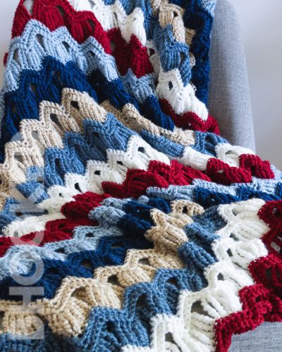
In a striped project, colors appear in long horizontal bands — so whatever you choose will be on full display for a lot of rows at a time. This means bold contrasts read really well in stripes, and tonal palettes create a beautiful gradient effect. Think about rhythm too: alternating two colors feels classic, while using four or five in a repeating sequence feels more modern and playful. The Color Sequence Calculator inside the tool will calculate exactly how many rows of each color you need based on your finished project length.
Granny Squares
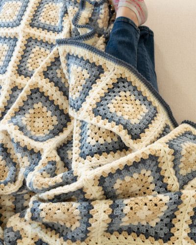
In granny squares, each round of the square is its own color, so colors interact at a very small scale before they repeat across the blanket. This makes granny squares one of the most forgiving formats for bold, unexpected color combinations — the geometry of the square mediates the contrast in a way that flat stripes don't. Dark outer rounds tend to make the squares feel defined and graphic. Light outer rounds create an airier, more vintage feel.
Corner to Corner (C2C)
C2C works on the diagonal, which means color changes feel more dynamic than in a standard striped layout. Gradient fades are especially stunning in C2C because the diagonal progression creates a natural sweep across the blanket. High-contrast color block layouts also work beautifully — the diagonal lines give even simple two-color projects a lot of visual energy.